A Festival by Any Other Name ...
Since the beginning, Tirgan’s goal has always been to be a true people’s event; a colorful showcase of Iran’s cultural diversity for all to enjoy.
But Tirgan’s brand has come a long way since the festival’s inception.
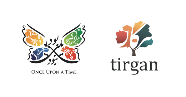
In 2008, when organizers were planning the inaugural festival, it was poised to be called ‘Once Upon a Time’. We designed the brand around that name, and the festival’s logo featured a playful butterfly, constructed out of the Persian words for ‘Once Upon a Time’.

When the actual festival name changed to Tirgan a few weeks before its launch, it was too late to change the typographic logo. So the butterfly became Tigran’s face.
That festival went on to become a huge success, raising the bar for staging Persian cultural events world-wide, and the butterfly logo became the representation of the new standards set by Tirgan.
So when I was asked to eliminate the old name from the logo for this year’s festival, the challenges were twofold. For one, the typographic nature of the butterfly meant that an entirely new logo had to be created. At the same time, I did not want to lose the trust and good will that the old brand had managed to accumulate.
The tree logo was the end result of explorations in various directions.
It represents the Gaokerena, the Tree of Life, and is as ancient as the legend of Tirgan itself. According to Persian mythology, Camros - a bird creature - brings the seeds of Gaokerena to the God Tir, who makes rain. Tirgan - by some accounts - is itself a celebration of the God Tir.
The colorful leaves of the tree represent the vibrance, youthfulness, and diversity of the festival. The negative space inside the tree makes up the Persian word for ‘Tirgan’. Both the colors and the typographic style of the logo are meant to preserve continuity with the old butterfly logo.
While the old butterfly carried the seeds of Tirgan on its maiden flight, I am hopeful that the new tree can stand on its own as our growing festival’s landmark for years to come.


